The background for this atc was stamped. The chevron pieces were created with a die cut and the flower and putterflies were punched. I put the flowers through an embossing fold to give the petals some dimension and added a big jute bow behind the flower. The butterfly trails were added with a pen and they have little black pearls for their bodies.
Friday, November 30, 2012
Chevron Trading Card
The background for this atc was stamped. The chevron pieces were created with a die cut and the flower and putterflies were punched. I put the flowers through an embossing fold to give the petals some dimension and added a big jute bow behind the flower. The butterfly trails were added with a pen and they have little black pearls for their bodies.
Thursday, November 29, 2012
Circular Windows
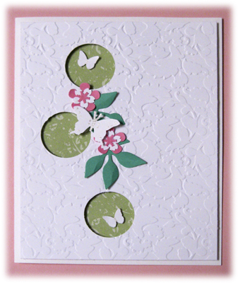
It's fun to sometimes add a little interest to the front
of the card with windows. The foundation for the
windows was embossed cardstock. To give it a little
more dimension I adhered that to the card front with
some foam tape. I put patterned paper behind it and embellished with some things I punched out.
Wednesday, November 28, 2012
Pretty Pink

The background on this card was folder embossed and the scallop edge was punched. The flowers were stamped and cut with a matching die - gotta love that combination! The leaves were punched and the label is a die cut.
Tuesday, November 27, 2012
Historic Ashcroft Part 3

Of course a wagon has four wheels and I thought they all deserved some attention. The photo above was as I photographed it. The photo below was adjusted using Topaz filters in Photoshop Elements. It is a sketch effect and I saturdated the color a bit.

Monday, November 26, 2012
Historic Ashcroft Part 2


While the old buildings were interesting and had charm, I found this broken wagon to have much more fodder for photography. It has really seen better days but is still clinging to life.
The photo on the right is interesting and pretty much as I took it. The bottom photo was converted to black and white using Photoshop Elements. I like that version, too.

Sunday, November 25, 2012
Historic Ashcroft

We traveled to the Aspen area and took a little detour to the historic town of Ashcroft which was established in 1880. There were 864 lots sold and at its height 2000 people lived here, brought by the silver mining in the area. But other areas proved to be much better for mining and by 1895 the population was reduced to 100. Many simply moved their cabins to Aspen.
This is the biggest collection of buildings, although a few more are scattered about. There is some attempt at maintaining them while still retaining their character so hopefully visitors can enjoy them for many years to come.
It's a pretty setting, surrounded by mountains. The bare trees in the background are aspen and it would be beautiful in the fall when the forest is ablaze with the brilliant yellow leaves. I think another trip is called for in October.
Saturday, November 24, 2012
Going Back In Time

I made this background many years ago. It started with carpet tape (sticky on both sides) adhered to a piece of plum cardstock. I sprinkled on some Beedz and then brushed on Pearl Ex for a beautiful shimmer that coordinated nicely with the shiny Beedz. I mounted that onto a black atc. The flourish and medallion are commercial. It's nice to use something from our stash now and then.
Friday, November 23, 2012
The Last of the Tubes

This is the last of the tubing. Again I put the tubes on a photo that I processed in Photoshop Elements. Looks like I gave it a "poster edge," one of my favorite effects. The butterflies were punched.
Thursday, November 22, 2012
Eat Your Turkey

I hope you get your fill of turkey and all the fixin's today. This is an atc I made using inchies. Gotta pull out those clever images now and then. I simply colored them with colored pencil, mounted them on a strip of cardstock and adhered them to background paper. The background was made with some sponging and stamping and has some gold highlights that aren't visible in the photo. I added a strip of burlap (which always reminds me of harvest time) and tied some jute into a bow.
Wednesday, November 21, 2012
Happy Thanksgiving

Happy Thanksgiving, visitors! I used this design for my Thanksgiving cards. The front of the card folds back at the center so if you were to look at it from the side, it would look like a pointed "h" sort of. The background is patterned paper and beneath that I stamped "thankful" in a hand-written script. The flower are adhered to the folded section and they were stamped and cut out. The leaves were also stamped and I added a think satin ribbon tied in a bow. The center of the flowers is a faux jewel.
Tuesday, November 20, 2012
More Tubing

Here's another atc that I made with the addition of tubes rolled from magazine pages. The background is part of an older photo of a waterfall that I just knew would be good for something at som epoint. I added a punched butterfly and three brads.
Monday, November 19, 2012
Autumn Leaves

I tried a new background technique where I spread white Distress Stain over clear embossed stamping which acted as a resist. The stain didn't go on evenly but I thought the irregularity added a nice touch. The leaves were stamped on the pages of an old dictionary, punched out and colored with Distress Ink. The embellishment is a soft ribbon in coordinating hues.
Leaves in our area are mostly on the ground now and will no doubt soon be covered with more snow. Might as well enjoy the changing of seasons as each one is special in its own way.
Sunday, November 18, 2012
Them's Berries

Does seeing blueberries remind you of a dog? We had Taffy, a Springer Spaniel, when we lived in Alaska. Blueberries were plentiful in the area and since they were big, delicious and easy to pick, we tried to collect them when we could. But because the black bear in the area also loved them, we took our dog with us as a guard as we picked. A lot of good that did us though. She was so busy picking berries from the bottom of the bushes that guard duties were the last thing on her mind. We suspected that if she got a whiff of a bear that overpowered the taste of the succulent berries, she'd make a run for the car without issuing any warning. She was quite a sight with blue-stained lips and teeth but she went home happy, never realizing she had a serious duty to perform.
Saturday, November 17, 2012
This I Know
 Here's another bit of writing I did for my online class. We have been encouraged to share what we write, otherwise you probably would never have seen this.
Friday, November 16, 2012
It's A Gray Day

Thursday, November 15, 2012
Black and White With A Blast of Red

This card was designed because I wanted to use some washi tape. The foliage is stamped and the butterflies are punched. The flower was stamped, cut out and layered. I used a border punch to complete the design.
Wednesday, November 14, 2012
I'm Resisting

This was a second card that I designed for our stamp club exchange, again using the leaf theme and a new technique.
I used white pigment ink and a grid background stamp on the white cardstock and then overstamped the leaves in dye ink. I added some ink dots and red "candee." This was mounted on dark brown and then adhered to the card front. The banner was cut from a Simon Says Stamp die. I inked the edges, stamped the text and added a gold leaf brad.
Tuesday, November 13, 2012
Autumn Theme
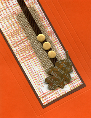
I designed this card for our stamp club exchange. We were challenged to use a leaf theme and a technique we hadn't tried before. My technique resulted in the colorful background. Using a ledger background stamp and a stamp positioner I stamped the background in one color. I moved it slightly, inked it with a different color and made a second impression. I repeated the method a third time with a third color.
I added a strip of burlap, some ribbon and three gold "candee." The leaf was also a new technique. I used white pigment ink for a resist, added Distress Ink for color and then stamped the leaf in black and cut it out. The completed focal piece was matted with dark brown and adhered to the front of the card. Then I used a sylus and scoring board to create some dimension on the card itself.
Monday, November 12, 2012
Tubing

I thought it might be interesting to incorporate some paper tubes into my designs. This is an artist trading card with tubes that I rolled from pieces of magazine pages, patterned, plain and text. The background is a failed image transfer that I kept because I thought it still had some good possibilities. I added a punched lavender border, three punched flowers and the pre-printed text.
Sunday, November 11, 2012
The Fastest Pitch

This was a layout I did after doing some journaling for my class. The page was created digitally, although I more often do regular scrapbooking. I'm trying to branch out a bit.
Saturday, November 10, 2012
Knotty

I'm taking an online journaling (writing) class that I think is very good. We write on a given topic every day but we also have occasional assignments. For this assignment we were to take a photo of something from afar and then get closer and closer as we continued to take more photos. We were to also try various perspectives. My perspective for this subject was pretty straight forward but I still found it an interesting project. And I think my writing is getting better!
Friday, November 9, 2012
Distress Marker Revisited

This card actually shows the same technique I used with the Distress Markers yesterday. The only difference was that I used an iridescent pearl water to blend the color so the image has a bit of sheen that dresses it up.
I added a star brad to the stamped star at the top of the tree and the banner was stamped and then cut out. I overstamped it with the text, both images from Simon Says Stamp.
The image was matted and adhered to a cream card.
Christmas before Thanksgiving. Okay, I admit it. It isn't my first Christmas card for the year. I don't care too much for the process of reproduction so I have to come up with a lot of different designs and it takes some time. I actually have over 100 already made.
Thursday, November 8, 2012
Distress Marker Technique 3

I further explored the possibilities of Distress Markers by using them to color my image. I heat embossed the holly on watercolor paper. I applied worn lipstick marker to color the berries, putting just a narrow line at the edge, then using a water brush to pull the color to the inside. I applied crushed olive marker to the leaves and again used the water brush to disperse the color to the inside. I actually did that a couple of times.
I heat embossed the text and tied baker's twine around the bottom. That was matted using two shades of green cardstock. I randomly made a "plaid" design using a scoring board on the front of a cream-colored card and adhered my holly to that.
Conclusion: Putting a narrow line of color at the edge of the image was made easier with a choice of two tips on the marker. I used the pointed end for the berries and the wider end for the leaves. Nice option! And the color blended nicely. I was able to get at least three shades by using just one color - not exactly Copic but faster and easier.
Wednesday, November 7, 2012
Distress Marker

This technique with the Distress Markers was similar to what I did yesterday except that I put the marker directly on a solid rubber stamp then misted it. After I did one image I misted it again for a second image but that one really wasn't so great and I deemed it unusable.
I matted the image on gold cardstock and then adhered it to a wide flag that I embossed with a folder. I tied baker's twine around avocado cardstock and then put a cut border at the bottom. All of the above was adhered to the front of a kraft card.
Conclusion: The markers blended well on the stamp and it made or a pretty simple way of adding a variety of color to the image.
Tuesday, November 6, 2012
Exploring Distress Markers

For this card I made a watercolor background. I scribbled marker directly onto watercolor paper, overlapping colors a bit. After I had three colors applied (photo, olive and honey) I misted the cardstock with water and let the colors blend. After it dried I was ready to invent a card.
I trimmed the watercolor background down a bit and inked the edges. I added, a wider copper ribbon and then a narrow dark brown with copper edges. The image is a clear stamp from Studio 112 that was in the $1 bin. I stamped it on another piece of cardstock that I colored with the honey marker and embossed with copper embossing powder. I stamped the center of the image again on the same paper as the medallion, punched a circle and popped it up on the medallion. I adhered it to the background so it extended beyond the edge. I added punched flowers to the center and tucked in three punched leaves with inked edges.
I cut off the right-hand side of the card - but later questioned the wisdom of that action. But I liked it well enough to use it. A used a border punch on brown cardstock and added dots of dimensional black paint to the centers of each flower. I also added a dot of paint to the flower in the center of the medallion and three dots above the ribbon.
Conclusion: I liked the way the colors blended together and it certainly made a quick and easy background. While I applied the color in horizontal bands, it would be effective to just randomly swirl them various places, too. That's something to try in the future.
Monday, November 5, 2012
All Together Now

Here's those four magnificent guys all together. One of the improvements made at Mt Rushmore in the past 15 years is a circle trail that goes from the amphitheater to the base of the mountain where the carvings which allows lots of different views of the sculptures. The evening progam where they light the sculpture is quite impressive. We saw it our last trip but didn't stay that late this time.
Sunday, November 4, 2012
Mt. Rushmore


As you look at them from left to right the order is Washington, Jefferson, Roosevelt and then Lincoln.
Washington is most dominant because he is located forward and he also gets a special profile viewing when you are on the road west of the park entrance.
I gotta say, they are all magnificent. To give you an idea of the size of these guys, Washington is 60' tall, his nose is 20' long and his mouth is 18' wide.


Saturday, November 3, 2012
Circle Card

Here's another design I did for the "anything but rectangular" card exchange. The flowers are stamped and cut out and I added a decorative brad for the center. The leaves are punched. The text is a line of text that I curved to match the shape of the card. The front edge of the card is actually where the kraft paper ends.
Friday, November 2, 2012
Another Not Rectangular


The second photo shows the inside of the card. I die cut a smaller label and added text and another punched butterfly.
Thursday, November 1, 2012
Not Rectangular

Subscribe to:
Posts (Atom)